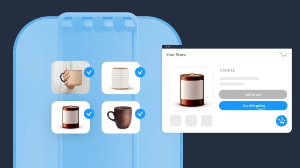
The benefits of shopper cart building are obvious—and can be pretty significant. When shoppers build up their carts before finally checking out, they’re spending more money on your site, saving you money with fewer shipments, and providing you valuable data about shopping trends.
When a shopper adds a product to a cart on an ecommerce site, it’s a strong indicator of intent to make a purchase. Some shoppers complete the purchase in the moment, while others continue browsing to add more items to their cart. There are also some shoppers that build their cart and abandon their purchasing flow for a multitude of reasons. At the end of the day, getting shoppers to click “Add to cart” offers some important signals about product resonance and shopper intentions.
These benefits are exactly why Buy with Prime has been focused on launching the Buy with Prime cart as a necessary enhancement. Shoppers want it. Merchants want it. And it’s here!
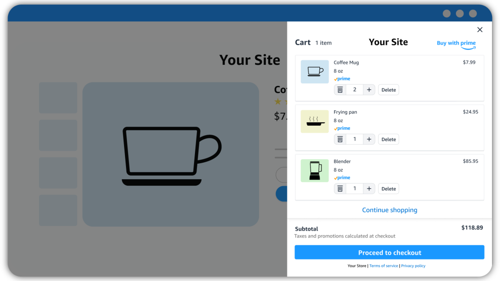
By adding the Buy with Prime cart to your online store, Prime members can purchase up to 20 eligible products in one transaction, helping you boost sales and average order value. In fact, merchants have experienced an average 15% increase in Buy with Prime units per order after adding the cart to their sites.*
The Buy with Prime cart also helps you optimize fulfillment costs and reduce waste, because Amazon can fulfill multiple products from one Buy with Prime order in fewer packages. With cart building activity and order data, you can gather insights about which products shoppers buy together to guide product innovation decisions, inventory planning, and marketing strategies .
Recommended merchant criteria for optimal results
Merchants with active Buy with Prime products can add the cart in just a few minutes, but Buy with Prime cart works better for some types of ecommerce stores and product categories, including:
- Online stores with Buy with Prime activated on most or all SKUs. Activating all, or at least a majority, of your SKUs with Buy with Prime opens more opportunity for cart building, says Carolyn Chuong Holgate, Product Manager at Buy with Prime. “This is particularly important because Buy with Prime cart can only be used for products that offer Buy with Prime.” Your standard checkout requires a separate cart for products that don’t offer Buy with Prime, and shoppers must purchase those separately.
- Online stores in categories with high units per order such as apparel and shoes, beauty, consumables, personal care, and sporting goods. Average add to cart rate, which is just less than 8% globally for all categories, is often higher in categories like these that have higher units per order. Naturally, these retail categories are going to be the ones that Buy with Prime cart works best for.
- Online stores with average selling prices under $25. Shoppers are generally more willing to add numerous items to a cart when price tags are lower. A shopper looking for a specific big-ticket item might have a set budget or only be interested in purchasing the one item. Meanwhile, casual shoppers might be too noncommittal to add multiple pricier items to a cart. So, Buy with Prime cart works best for online stores with plenty of lower-priced products.
- Online stores with complementary products. The more add-ons or accessories shoppers might “need” to complement a product they can purchase on your site, the more opportunity there is for them to add more items to their cart. Buy with Prime cart works well for online stores with products that have complementary accessories or products that work well together.
Best practices to optimize Buy with Prime cart
The same best practices for optimizing your standard cart apply for Buy with Prime cart, but the added benefit is that the buy-now experience for Buy with Prime has been shown to increase shopper conversion by 25% on average . (This data point measures the average increase in shoppers who placed an order when Buy with Prime was an available purchase option versus when it was not, during the same time period.)
So if you follow these tips to get more of your products in shoppers’ carts—meaning more units per order—then you’re already in good shape to take them across the finish line.
#1 Customize the cart icon placement
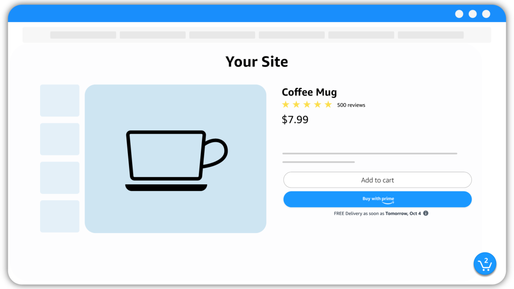
Also known as “mini cart” to some, the Buy with Prime cart icon is the little shopping cart symbol that indicates how many Buy with Prime-eligible products a shopper has waiting in their cart. This icon is visible throughout the shopper’s journey while they browse your site. The shopper can click on this icon at any time to see what’s in their Buy with Prime cart or make changes.
“The default placement for the icon is on the bottom right of the web page, but you can customize the location to your liking,” explains Carolyn, Product Manager at Buy with Prime. “To make it easy for your shoppers to interact with the Buy with Prime cart icon, we recommend placing it in a location that doesn’t already have page elements for shoppers to engage with, like buttons and banners.” Consider conducting A/B tests that compare different icon placements to find the one that lands the most clicks and conversions.
#2 Activate all of your SKUs with Buy with Prime
Because Buy with Prime cart works best for merchants with Buy with Prime activated on all, or the majority, of their products, an easy tip for optimizing cart is activating more SKUs. It’s a game of numbers: The more products available, the more opportunity for cart building. “And if all your products offer Buy with Prime, then shoppers can buy any combination of products in one transaction using Buy with Prime cart,” Carolyn says, “rather than having to check out twice, once with Buy with Prime and once with your native cart.”
#3 Boost discoverability of your products that offer Prime shopping benefits
If shoppers on your site can’t find your products that offer Buy with Prime, they can’t add them to a cart—or purchase them. There are a few ways you can help shoppers discover them:
- Create a collection page. This is a dedicated web page (or pages) that showcases all of your products that offer fast, free delivery through Buy with Prime. You can link to the
collection page
in your global top navigation, as a call to action in the hero banner, or as a pervasive banner across your website. Whichever option you choose, make it easy to see and click.
- Promote them on your home page. Spotlight popular products offering Buy with Prime on your home page to drive interest, or use
approved messaging and the Buy with Prime badge
to promote that you offer Prime shopping benefits on your site.
- Cross-promote complementary products on product pages. Cross-promoting complementary items and accessories on a product page offers an opportunity to showcase more of your products to engaged shoppers during a key moment in their shopping journey. Seeing complementary products side-by-side and during this moment of consideration makes it easier for shoppers to add more to their cart, thus increasing your sales.
#4 Educate and motivate shoppers through messaging
Sprinkle additional messaging throughout your site to help shoppers understand how Buy with Prime cart works and inspire them with an improved shopping experience.
- Add text for guidance. While cart building might be second nature for most ecommerce shoppers, some might appreciate conveniently placed text for guidance or additional information. For example, you could include a tooltip near your checkout buttons that shoppers can hover over to see more information about Buy with Prime cart.
- Use “click triggers” near the Buy with Prime button. These include messaging that calls out promotions or sales, helps eliminate doubt, simplifies the purchase process, or provides a guarantee. The Prime delivery estimate already does most of these well, helping to eliminate doubt and providing assurance with transparent delivery estimates, free shipping, and free returns on eligible items. It also helps simplify the purchase process by signaling to Prime members that they can check out quickly and securely using their Amazon account.
- Explain Buy with Prime cart in your site FAQ. This can help shoppers learn about the differences between Buy with Prime cart and your native cart checkout flow, especially if you don’t have Buy with Prime activated on all of your SKUs.
#5 Set up automated abandoned checkout emails
Using an email marketing provider like Klaviyo, you can identify and reengage shoppers that started checking out using Buy with Prime but then dropped off before completing the order. The Klaviyo for Buy with Prime app doesn’t work for shoppers who simply add products to their carts. However, once they start checking out using Buy with Prime—any step after clicking the Buy with Prime button—you can trigger the abandoned checkout email flow if they drop off.
Using the app and abandoned checkout flow helped work and travel bag brand Sherpani capture orders that it would have otherwise lost. Says Alexis Beuning, Sherpani Sales and Brand Manager for DTC sales, “Placed orders were 30.7% higher through our abandoned checkout flow using the Klaviyo for Buy with Prime app compared to the abandoned checkout flow not using the app.”
#6 Optimize the Buy with Prime button
This is something you can—and should—do regardless of whether you activate Buy with Prime cart. What may seem like small adjustments to the look and placement of the Buy with Prime button can actually have a big impact on whether shoppers start adding to their cart—and ultimately convert.
- Customize the button. With Buy with Prime, you can
customize the button
to match the style of your site and product pages, including shape, size, and color scheme. While matching the button to your brand, you also want to make the button big enough to tap (think mobile shoppers) with enough white space between other checkout buttons.
- Place the button above the fold. There’s a reason the top news stories are placed above the fold in a newspaper (or on a news site today): It gets more attention. In fact, in the
Nielson Norman Group’s latest eye-tracking study
, participants spent about 57% of their page-viewing time above the fold and 74% in the first two screens. The same goes for a product page. Ideally you can place the Buy with Prime button on the product page where it’s visible without requiring shoppers to scroll.
- Place the button directly below the native cart. In A/B tests of randomized shopper experiences with Buy with Prime cart compared to those without, “merchants have seen the most success when placing the Buy with Prime button directly below the native cart,” Carolyn says. “Shoppers can see all available checkout options in a single location, making discovery of Buy with Prime easy.” And of course, conduct your own A/B test of Buy with Prime button placement to find what drives the most sales.
If you’re ready for Prime members to start building their carts on your ecommerce site, sign in to the merchant console and set up Buy with Prime cart . If you’re not yet a Buy with Prime merchant, you can get started today .
*Data is from a sample of 34 Buy with Prime merchants, and 15% is the average of the increase in units per order (comparing 30 days prior to and post cart launch) for each Buy with Prime merchant in the analysis.


